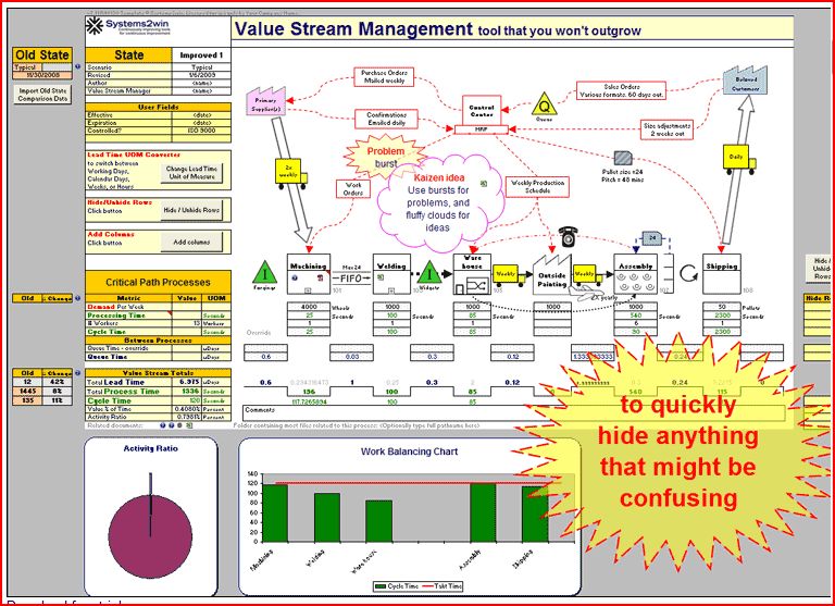
Value Stream Mapping is a process most consider an exercise for finding and removing waste. It is a foundational Lean Tool that typically gets introduced early in a Lean Transformation. A Systems2win Excel template is depicted below:
Value Steam Mapping is a powerful tool in the Lean arsenal but is far from the only kind of mapping that will compliment the Lean practitioner. Though I cannot go over every mapping tool, I believe there are a few that deserve special attention. Utilizing the Value Stream Mapping process typically limits you to an internal process. It is a difficult correlation for customer facing experiences.This is why these other maps play a role in the way I go about services and sales and marketing.
Metrics-Based Process Mapping (MBPM) is a tactical-level, visual mapping approach that enables improvement teams to make effective, data-based decisions regarding waste elimination and measure ongoing process performance. The mapping technique, often used to drill down from a value stream map, integrates the functional orientation of traditional swim-lane process maps with time and quality metrics that are essential for designing improved processes.
A Relationship Map (Organization Level) visually depicts the “parts” of an Organization, and the internal or external supplier-customer relationships among those pans. It follows a general left to right (resource conversion) sequence represented by the same three components: Suppliers, the Organization, and Customers. It does not explicitly show work activities. Rather, it shows the input/output connections or linkages among selected pans oi the organization. (The rectangle symbol represents a cluster of resources and activities that often represent departments or functions, i.e. structural building blocks of that organization).
A Flowchart (Job/Performer Level) is a graphic representation of the sequence of work activities used to create, produce, or provide a single specific, unique output. It may be used to categorize work activities as value creating or non-value creating.
A Cross-Functional Process Map or Swimlane Diagram (Process Level) illustrates workflow in organizations. A workflow consists of a set and series of interrelated work activities and resources that follow a distinct path as work inputs (resources) get transformed into outputs (items) that customer’s value. The name, “cross-functional process map” means the whole (end-to-end) work process “crosses” several functions or other organization entities. It also called a swimlane diagram because the pattern of the horizontal bands is similar to the lanes of an Olympic swimming pool (as seen from above the pool). Whereas the relationship map only shows the parts of an organization, the cross-functional process map shows you the work that takes place within in each part. Note that the rectangles that represent organization “parts” on a relationship map become horizontal bands or “swimlanes” on the cross-functional process map.
Many think that Value Stream Mapping is for the Lean people and Process Mapping is for Six Sigma. Ben Graham is President of The Ben Graham Corporation and author of the book Detail Process Charting: Speaking the Language of Process. Podcast The Granularity of Process Mapping Transcription Capturing the Flow of Information
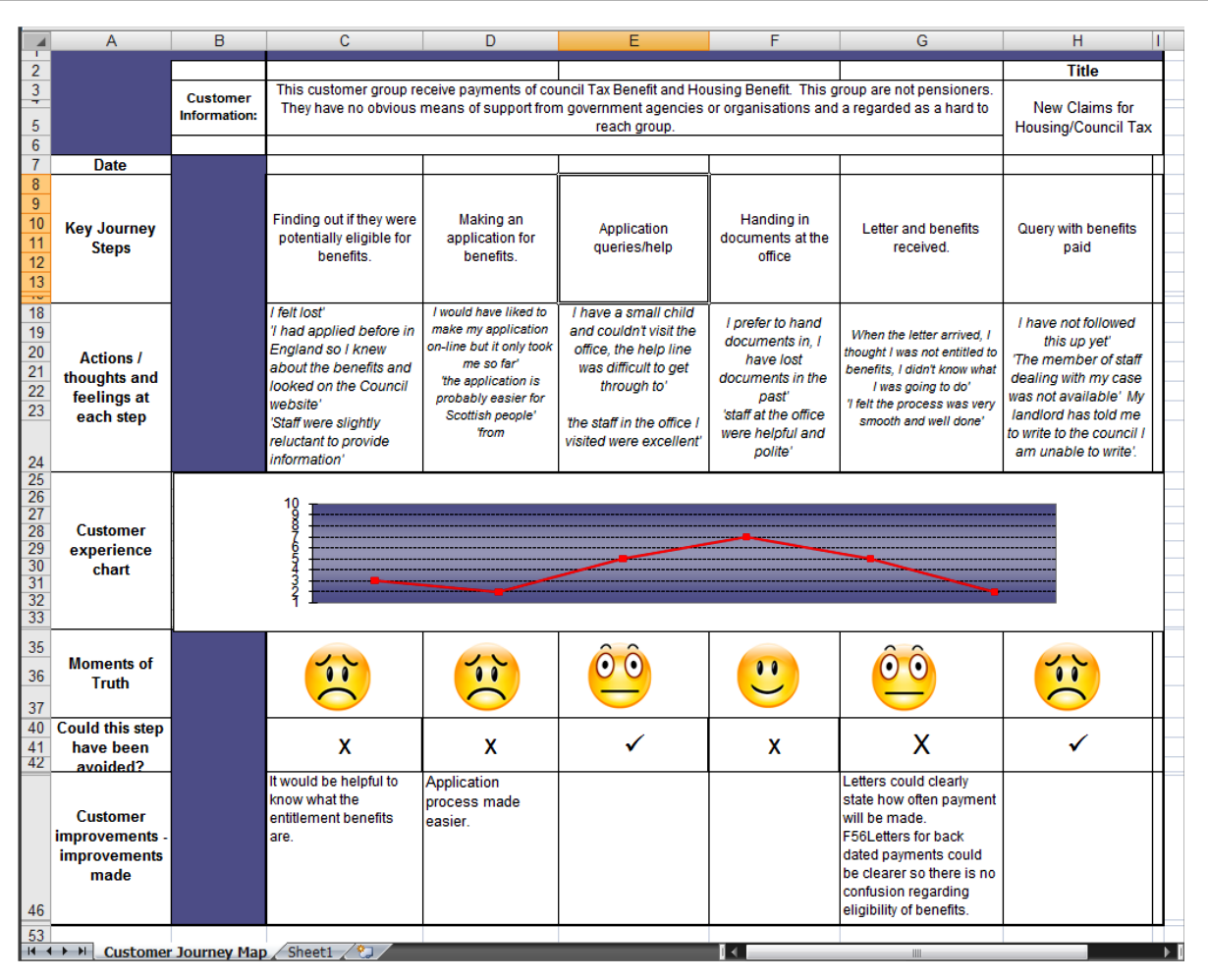
The preferred method of mapping the customer experience is through a journey map. I prefer two styles, one a basic Excel Template that is very similar to a typical Swim Lane chart commonly used in Lean.
From Smart Cities – A guide to using Customer Journey Mapping
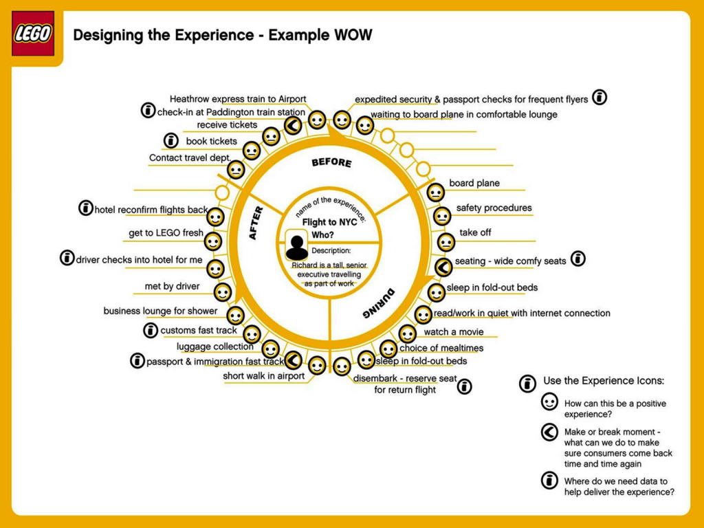
Another is circular method demonstrated by the Lego Wheel. Lego uses tool called a ‘customer experience wheel’ to map an existing experience. “We understand what is and what is not important to the customer in that experience and then we design a ‘wow’ experience to improve it.” Though I like the wheel better I have not found a program that could make it easy for me to draw and distribute.
A good post on discussing some of the pros and cons of different types of Journey Maps can be found at Visualizing the customer experience using customer experience journey maps.
The Journey Mapping Guidance Cabinet Office[1]
Go to the next page Mapping/Implement
Extra Material:
An Influencer diagram is like a mind map, with a central theme, and components surrounding it. When used in marketing, I will start with maybe a certain campaign, strategy or event and surround it with the different marketing aspects. You should group each by the strongest relations that they have to each item. Now step back from it for a moment and consider the influence each item had on another. Lightly pencil in an influence let’s say that a direct mail piece or press release had on an event. Place an arrow on the end showing the direction of influence. If the influence was reciprocal, place an arrow on each. If the influence was greatly unbalanced in one direction, two arrows are typically used with one being a much heavier weight. For better visualization, you can draw circles around different groupings. That can be quite interesting because you can rate somewhat of a Venn diagram in the process.
Influencer diagrams can be rather revealing. The first thing they do is typically cause great debate. During the debate, it will become much clearer where the influences are the strongest and also the kinds of influence that are created. There can also be influences that happened outside of the groupings. As you explore the diagram, lines may be added and even removed. This exercise creates thinking about how your marketing structure actually operates in contrast to the typical flow diagrams. You may even add a few notes about the line to substantiate your decisions of the influencers.
In today’s marketing, I do not believe that one single event or action really works anymore. My philosophy of marketing states that is the strength of the connection between each of these events or actions that will determine the degree of success that you will have. This simple diagram highlights the gaps in that type of thinking. Also, look for the existence of tails, components out of limb, which have no leading or leaving them. These components are certainly ones that need to be debated and the question asked why they are there? Another use would be for a new event. See how existing influencers can play a part in developing the structure for this new venture. It also can be quite useful in planning for resource and budgeting.
I encourage you to try this type of diagram. This is one of the most useful and simplest tools that I have utilized and the one that has created the most activity and discussions in groups. It is simple introduction to a Value Network Map.


